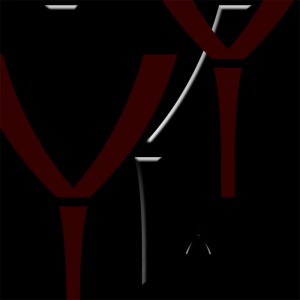
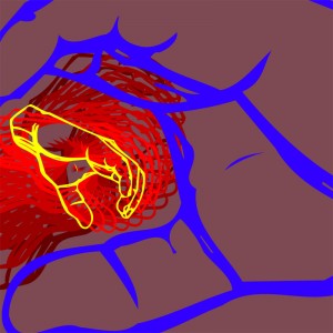
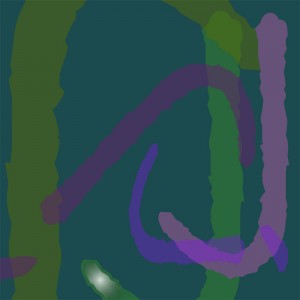
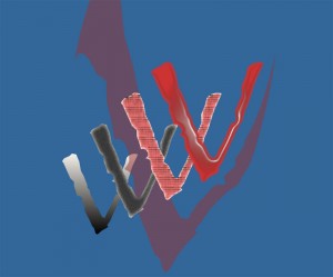
Here are the 5 compositions that comprise Project 1, The Letter.
#5 Moonrise Over a Range of Parentheses
Did you start with one typeface or experiment with several different typefaces? What were the advantages and challenges of your approach?
I started by really looking at the dozens of typefaces loaded on my computer. I was surprised how many were similar and amazed by some of the more graphical fonts. Some were clearly appropriate for my initial approach to the project (learning the various tools, manipulating layers, etc.) but I found the unusual fonts (e.g. sign language) far more compelling from a design perspective.
Did you choose the 5 letters at random or do you have a personal connection to any or all?
The selection process had nothing to do with the actual letter but the graphical characterization it portrayed. A “j” in one font paled to that of another. So I tended to use the Mac’s Font Book to peruse all the fonts looking for characters that seemed interesting.
Did you rasterize your letters in order to manipulate them as visual forms? How did this affect the final compositions?
I did rasterize some of the letters, but only when I wished to apply a texture or accent to part of the letter. In the final composition of the assignment (Moonrise Over a Range of Parentheses), it was only after flattening the layers that I was able to blend/smudge the borders of the flattened layers (there was a unacceptable hint of an outline). I certainly appreciated labeling the layers, and later in the project appreciated organizing layers into folders as particularly helpful.
Which is your favorite composition and why? How did you decide it was ‘finished’?
The final composition (Moonrise Over a Range of Parentheses) was a joint effort by me and my wife. She experienced the scene and designed the piece. Based on her description of the scene, she approved (or edited) various permutations throughout the development of the piece. It was one of those, “what if you did (this or that)” or “is there a way to (do this or that)” collaborations until she said, “That’s it.” We both knew at this point that more was essentially less, so to the blog it went.


