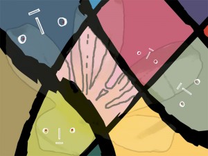
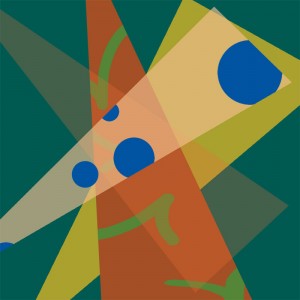
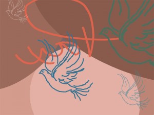
Here are the 3 compositions comprising Project 3, The Scratch Things.


How were they different than working with continuous tones?
I again had difficulty dealing with the geometric shapes I wished to fill and illustrate as did Kandinski on some of his work. All things being equal, I ended up using the text tool to create massive letters that I then positioned as I would have had I used a line tool in Illustrator (that I don’t own). The result was interesting, and created the geometric shapes that I filled with my warm palette. I liked the result, and the value of working with fixed tones became clear whenever I wished to change hues or saturation.
How did you choose which colors to work with?
My version of Photoshop doesn’t have the color palettes compiled as sets as on the new versions, so I used Google Images to search Palettes. Quite a few came up, and after saving them as .jpg files, I opened them in PS and used the color sampler to pick my colors. This process worked quite well.
Did some color combinations tend to work better than others?
After the initial color selections were made, I embellished the composition with drawings based on real photographs or artwork in our personal collections. The width and color of the brush of these drawings conflicted with the painted geometric shapes of Kandinski so I softened them with reduced opacity before filling in on a separate layer. The softened colors blended nicely with my palette choice.
